Build a balanced 5‑color palette from a single starting color.
The room color palette generator takes one main color and instantly builds a complete room scheme — wall, trim, accent, decor and neutral — using the 60‑30‑10 rule that interior designers trust.
Use the room color palette generator without color theory guesswork or mismatched swatches. Just a harmonious palette ready for paint, fabric and furniture.
Four color harmonies — and when to use each.
The harmony type selected in the room color palette generator determines how the colors relate to each other on the color wheel. Each creates a different mood and suits different rooms.
Analogous
Colors that sit next to each other on the color wheel. Creates a serene, comfortable and cohesive look that feels natural and unforced.
This is the safest harmony for entire rooms. It is almost impossible to get wrong and suits living rooms and bedrooms where relaxation is the priority.
Best for: living rooms, bedroomsComplementary
Colors from opposite sides of the color wheel. High contrast, bold and energetic — perfect for making a statement.
Use this for spaces where you want visual drama. Pair a dominant color with its opposite as the 10% accent for maximum impact without overwhelming the room.
Best for: dining rooms, officesTriadic
Three colors evenly spaced around the color wheel. Vibrant and balanced, even with bold hues that would otherwise clash.
Works best in creative spaces and open‑plan areas. Let one color dominate at 60% and use the other two as the 30% and 10% for structure.
Best for: creative spaces, kids’ roomsMonochromatic
Variations of a single hue using different tints, tones and shades. Elegant, sophisticated and timeless when done well.
Ideal for minimalist interiors and bathrooms. Texture becomes critical here since the color palette is intentionally restrained — layer linen, wood and metal.
Best for: bathrooms, minimal spacesSee how a color palette comes together in a real room.
These steps cover the essentials: picking a starting color, applying the 60‑30‑10 rule, and testing paint samples before committing to gallons.

Build the palette
Start with one color you love. The generator instantly builds a complete 5‑color scheme around it.
Pick from the color wheel or paste a hex code. The harmony type determines how the colors relate to each other mathematically.
Apply the 60‑30‑10 rule
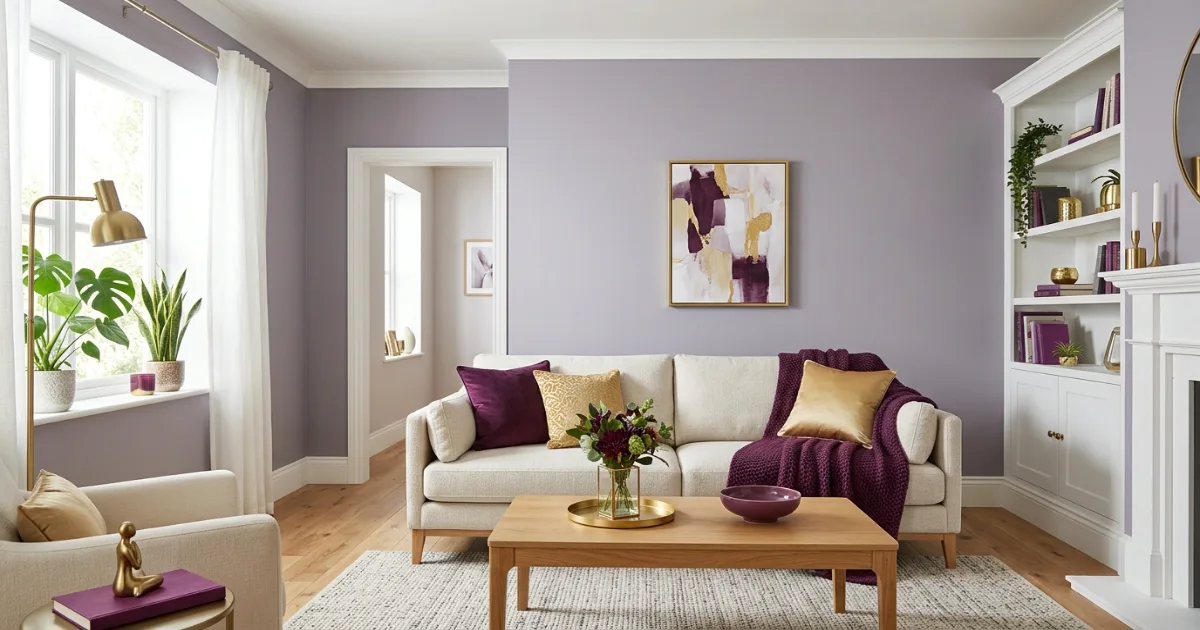
The dominant color covers 60% of the room — usually walls. The secondary color takes 30% — trim and upholstery.
The accent fills the last 10% — cushions, art and small decor. This ratio creates visual balance in any room.
Test before committing
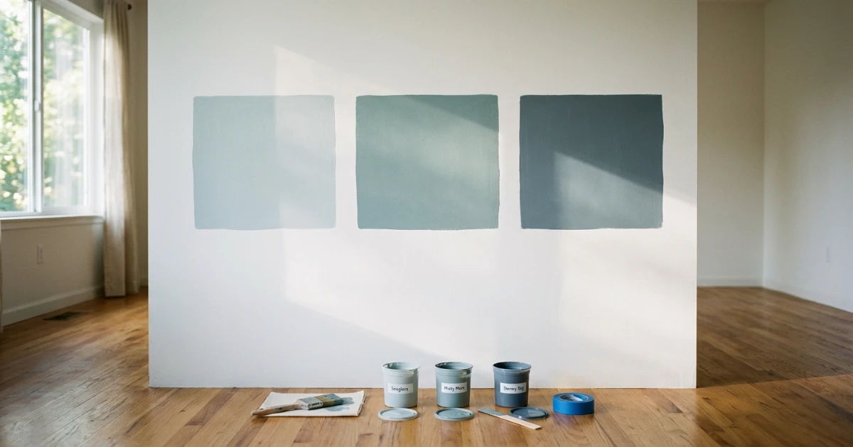
Paint large 12×12 inch samples on at least two walls. Check them in morning light, afternoon sun and evening lamp light.
A color that looks perfect on a swatch can shift dramatically across a full wall. Live with samples for 48 hours.
Read the generated color roles
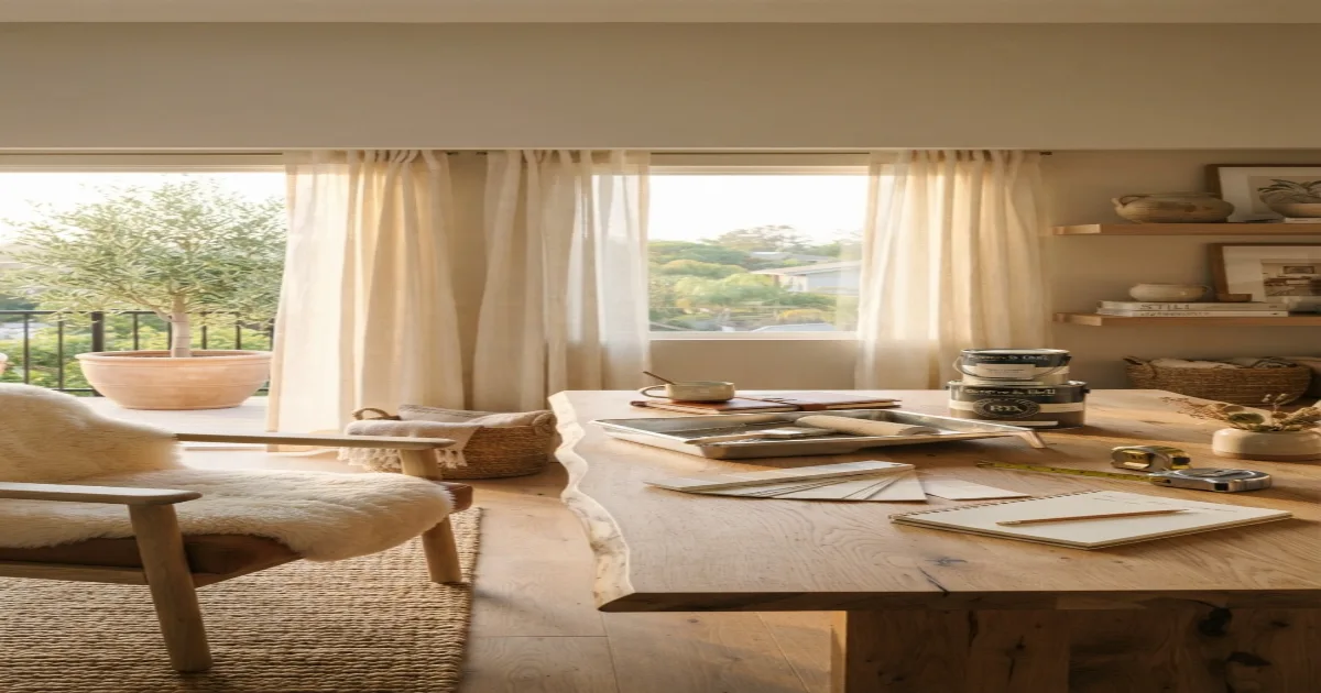
Use the five swatches as wall, trim, accent, neutral and decor references, then verify them with physical paint and material samples.
How to build a room color palette — the complete guide.
The 60‑30‑10 rule is the foundation of every well‑designed room. 60% of the room should be the dominant color — usually walls and large furniture. 30% should be the secondary color — trim, upholstery and window treatments. 10% should be the accent — cushions, art and small decor items. This ratio creates visual balance without feeling formulaic or staged.
How to use the room color palette generator
The room color palette generator is designed to turn one starting hue into a practical five-color interior scheme. Enter a hex code or choose a color visually, select a harmony, and review the generated wall, trim, accent, neutral and decor roles.
Use the room color palette generator as a planning tool rather than treating every digital swatch as a final paint match. Screens, room lighting, paint sheen and surrounding materials can change how the same color appears in a finished interior.
For the strongest result, run several starting colors through the room color palette generator and save the schemes that still work with your flooring, furniture, curtains and fixed architectural finishes.
The room color palette generator becomes more useful when you test the proposed dominant, secondary and accent colors at realistic scale. Paint large samples, place fabric or flooring samples beside them and observe the combination throughout the day.
When two generated colors feel too similar, use the room color palette generator to try another harmony or adjust the starting hue slightly. The final palette should provide enough separation for walls, trim, furniture and decor to remain visually distinct.
A room color palette generator can organize color relationships, but personal preference and real-room testing still decide the final scheme. Keep the generated hex values as a reference while comparing physical paint cards and material samples.
Step 1: Pick your starting color
Start the room color palette generator with one color you genuinely love. It could come from anywhere — a piece of art you already own, a rug that anchors the room, a cushion fabric you keep coming back to, or a paint swatch you have been eyeing for weeks at the hardware store.
This single color anchors every result created by the room color palette generator. Everything else the generator produces will be built around it using precise color wheel mathematics and established design ratios.
If you are unsure where to begin, look at your wardrobe. The colors you wear most often are usually the ones you feel most comfortable living with day after day. That navy blazer, that olive sweater, that rust scarf — these are clues to your personal color preferences.
Another reliable trick: look at a favorite photo, a travel postcard or a fabric pattern you have saved. Extract one color from it and let the generator build the rest of the scheme around that single reference point. The result will feel personal rather than generic.
Step 2: Choose a color harmony
Analogous harmonies are the safest and most popular choice for entire rooms. They use colors that sit next to each other on the color wheel — like blue, blue‑green and green, or terracotta, orange and warm yellow.
For an additional color-wheel reference, compare the generated relationships with the Adobe Color wheel. It lets you explore analogous, complementary, triadic and monochromatic relationships from a selected base color.
This creates a calm, unified look that is almost impossible to get wrong. It is the go‑to harmony for bedrooms, living rooms and any space where relaxation and comfort are the main priorities.
Complementary harmonies use colors from opposite sides of the color wheel for high contrast and visual energy. Blue and orange, purple and yellow, red and green — these classic pairs create drama and excitement in a space.
Triadic harmonies use three colors evenly spaced around the wheel at 120‑degree intervals. This is the boldest option and works especially well in creative studios, children’s bedrooms and open‑plan living areas where each functional zone can lean into a different part of the triad.
Monochromatic harmonies use a single hue in multiple lightness values — from pale tint to deep shade. This is the most sophisticated and minimalist option, relying entirely on texture, material variety and subtle tonal shifts to create depth without introducing any new colors to the palette.
Step 3: Apply the 60‑30‑10 rule
The dominant color should cover roughly 60% of the room’s visual surface area. This is almost always the wall color, though in some rooms a very large sectional sofa, a floor‑to‑ceiling bookcase or an oversized area rug can also serve as the 60% anchor.
The secondary color takes up about 30% of the visual space. This is typically the trim and ceiling paint, window treatments, larger upholstery pieces like an armchair or ottoman, and sometimes a feature wall or built‑in cabinetry.
The accent color fills the remaining 10%. Use it for cushions, throws, artwork frames, vases, lampshades, small decor objects and the occasional statement chair. This is where you can afford to be bold and experimental.
Accent colors are easy and inexpensive to change seasonally. A bright coral or deep teal that feels too risky to commit to on four full walls is perfect in small, swap‑able doses that can be refreshed whenever your taste evolves.
The 60‑30‑10 rule is not a rigid mathematical formula but a guiding principle. If a room feels slightly off but you cannot identify why, check the proportions. Usually one color is dominating too much or the accent is too timid to register from across the room.
Step 4: Balance warm and cool tones
Every successful room palette mixes warm and cool undertones. An all‑warm room — beige walls, terracotta accents, brass fixtures — feels cozy and enveloping but can read as heavy, dated or monotonous after a while, especially in rooms with abundant natural light.
An all‑cool room — grey walls, blue upholstery, chrome fixtures — feels fresh and crisp but can feel cold, sterile and uninviting, particularly in north‑facing rooms with limited daylight or in climates with long grey winters.
The fix is surprisingly simple. If your dominant color is warm, let the secondary or accent color introduce a deliberate cool note. A warm greige wall paired with a cool blue‑grey trim creates balance without losing the cozy, grounded foundation you wanted.
In monochromatic schemes, vary the warmth by choosing one slightly warmer tint and one slightly cooler shade of the same base hue. This subtle temperature shift is what separates a designer monochrome room from one that feels flat, lifeless and one‑dimensional.
Step 5: Test with paint samples — never skip this step
Never commit to a wall color based on a screen display, a paper swatch or a curated Instagram photo. Paint colors shift dramatically depending on the quality and direction of natural light, the colors of surrounding surfaces, and the sheer scale of the painted area.
Buy sample pots and paint large squares — at least 12 by 12 inches — on two different walls. Choose one wall that gets direct sunlight and one that stays in shadow for most of the day. Observe both samples at different times: morning, noon, afternoon and evening under artificial lamp light.
A color that looked perfectly soft and muted on a tiny 2‑inch paper chip can feel overwhelmingly bright and saturated across four full walls. Similarly, a color that seemed vibrant and rich in the store can turn muddy, dull and lifeless in a room with only northern exposure.
Live with the painted samples for at least 48 hours before buying gallons of paint. Check them on a sunny day and an overcast day. Look at them when you wake up and when you go to bed. If the color still feels right after two full days of living with it, you have found your wall color with confidence.
Step 6: Use neutrals as the glue that holds everything together
Every successful palette needs at least one true neutral — white, cream, greige, charcoal or soft beige. Neutrals give the eye a place to rest and prevent the room from feeling over‑designed, chaotic or visually exhausting.
The trim and ceiling are usually the best and most natural places for neutrals. White or off‑white trim frames the wall color cleanly, defines the architectural edges of the room and makes the space feel taller, brighter and more finished.
In the room color palette generator, the lightest color in your palette is almost always the best candidate for trim and ceiling paint. It is light enough to reflect daylight deep into the room while staying visually connected to the overall color scheme.
Do not underestimate the power of a well‑chosen neutral. The right greige or warm white can make every other color in the room look more expensive, more intentional and more pulled‑together, while the wrong neutral — too pink, too yellow, too stark — can make even a beautiful palette feel slightly and inexplicably off.
Step 7: Pull accent colors from existing elements in the room
If the room already has a rug you love, a piece of art that speaks to you, a vintage chair with beautiful upholstery or even a view of greenery outside the window, pull your accent color directly from that existing element. This creates instant, unforced, organic cohesion.
The room color palette generator can help you identify and reuse the exact hex code of that reference color. Use a color picker app on your phone to sample the color directly from a photo of the item, then paste the hex code into the generator and let it build the rest of the palette around that single extracted reference point.
The result will be a room that feels collected, personal and layered over time rather than decorated straight from a single catalog page. This is the difference between a room that looks designed and a room that feels lived in and loved.
The room color palette generator also works when you are starting completely from scratch without existing furniture or decor. Simply pick a color you love and use the room color palette generator to create a palette that can guide every future purchase — from paint to furniture to the smallest decorative accessory.
Use the room color palette generator with accessibility in mind
A room color palette generator can suggest attractive combinations, but important labels, controls and instructions should not rely on color alone. The W3C guidance on the use of color explains why information should also be communicated through text, shape, pattern or position.
When a generated palette will be used on a website, app, sign or printed information panel, check text and background combinations against the W3C minimum contrast guidance. Interior paint choices do not need web contrast ratios, but readable labels and digital previews do.
The room color palette generator therefore shows hex values and named roles alongside visible swatches. These labels help users understand the palette even when two colors appear similar on a particular screen.
Step 8: Avoid the most common color mistakes that designers see repeatedly
The single most frequent mistake is choosing a wall color that is too saturated. A color that looks pleasantly muted and sophisticated on a small swatch can feel overwhelmingly intense across four full walls. When in doubt, go one shade lighter or more muted than your first instinct.
Another common error is forgetting that floors and ceilings are active parts of the color scheme, not neutral blanks. Wood floors add warmth, grey carpet adds coolness, and a bright white ceiling reflects and slightly tints the wall color. All of these surfaces need to be factored into the palette.
A third mistake is matching every color in the room too precisely. A room where the cushions, rug and art all share the exact same accent shade looks staged and artificial. Vary the accent slightly — a lighter tint here, a darker shade there, a slightly warmer version on the other side of the room — for a more natural, collected feel.
Finally, do not ignore the emotional impact of color. The colors you surround yourself with affect your mood, energy and sense of wellbeing. A bedroom painted in a high‑energy complementary scheme may look striking in photos but make it harder to wind down at night. Match the color energy to the room’s purpose.
Color psychology at a glance — how different hues shape the feel of a room
- Blue — calming, serene and trustworthy. Ideal for bedrooms and bathrooms where relaxation is the goal. Light blues expand a space visually and reflect light beautifully. Dark navy blues add depth, formality and a sense of occasion to dining rooms and studies.
- Green — restorative, grounding and connected to nature. Works in virtually any room. Sage and olive tones are trending for kitchens and living spaces because they bridge the gap between warm and cool while connecting the indoors to the natural world outside the window.
- Warm neutrals (beige, greige, taupe, warm white) — versatile, timeless and endlessly flexible. The safest foundation for any room in any style. Layer generously with texture and pattern to keep the space from feeling flat, one‑note or under‑designed.
- Lavender and violet — creative, luxurious and quietly dramatic. Use in bedrooms, dressing rooms and creative studios. Pale lavender reads almost as a neutral from a distance while adding subtle personality and warmth that pure white cannot deliver.
- Terracotta and rust — warm, earthy and deeply grounding. Inviting in living rooms and memorable in entryways. Pair with natural wood, raw linen, aged brass and handcrafted ceramics for a cohesive, organic, collected feel that never goes out of style.
- Charcoal and black — dramatic, sophisticated and surprisingly versatile. Use sparingly as an accent or go all‑in with a dark, moody room. Black anchors a palette, defines edges and makes every other color in the room look more vibrant by contrast.
Helpful room planning topics.
A color palette is just the starting point. Once you have your five colors locked in, plan the furniture layout, rug dimensions and wall art placement. Use these supporting guides to complete every layer of the room.
Six things interior designers always check before finalizing a color palette.
Test paint on every wall, not just one
Light hits each wall differently throughout the day. A color that looks perfect on the window wall at noon can look completely different on the opposite wall at dusk. Test large samples on at least two different walls before committing to gallons.
Pull the accent from the room, not the paint store
Your accent color should come from something already in the room or something you plan to bring in — a rug, a piece of art, an heirloom chair. This creates instant cohesion that a purely theoretical palette cannot match.
Use the ceiling as the fifth wall
A ceiling painted a shade lighter than the walls makes the room feel taller and more open. A ceiling painted a soft tint of the wall color adds warmth and envelope. Pure white is safe, but it is rarely the most interesting or flattering choice for every room.
Layer in texture, not just color
A monochromatic room lives or dies by its textures. Linen, velvet, raw wood, brushed metal and chunky wool in the same color family create depth and interest without introducing new hues. Texture is the secret weapon of restrained palettes.
Follow the color flow between adjacent rooms
Rooms that open into each other should share at least one color to create visual continuity. It does not have to be the wall color — a shared trim color, a consistent accent shade or a common neutral base is enough to connect the spaces elegantly.
Live with the palette for a full week before buying
Pin fabric swatches, paint chips and material samples to a board. Place the board in the actual room and look at it in morning light, afternoon sun and evening lamp light for at least seven days. A palette that excites you on day one should still feel right on day seven.
Room color palette questions — answered.
12 calculators for every room decision.
Every tool uses professional designer formulas. Free, instant, no sign-up — just enter your room and get the exact answer.
Bookmark HomeStyle Calculator for every room in the house.
From a 5‑color palette in the living room to a monochromatic scheme in the bathroom, our free tools give you the exact wall, trim and accent colors before you buy a single paint sample.