Plan a Gallery Wall that Actually Fits.
Enter your wall width, frame count and spacing, and get an instant layout width, column-and-row arrangement, and the exact hanging height from the floor — using the same spacing and eye-level rules professional installers use. No guessing, no lopsided arrangement, no holes in the wrong place.
Add up your frame widths plus 2 to 4 inches of spacing between each one to get the total layout width, then center that layout at 57 to 60 inches from the floor, or 6 to 8 inches above any furniture below it.
Common gallery wall sizes, frame counts and hanging heights.
These estimates assume standard 3 inch spacing and medium 11×14 inch frames. Use the calculator above for a layout matched to your exact wall width and frame plan.
| Wall Type | Typical Frame Count | Layout Width | Hanging Height | Notes |
|---|---|---|---|---|
| Above a sofa | 5–9 frames | 2/3 of sofa width | 6–8 in above sofa back | Center on the sofa, not the wall |
| Above a console table | 5–7 frames | Match console width | 6–8 in above console top | Keep layout within table width |
| Stairway wall | 8–15 frames | Follows stair rake | Centered on the diagonal sightline | Use uniform spacing along the rake |
| Standalone accent wall | 5–12 frames | Fits comfortably in wall width | 57–60 in to center | Standard eye-level rule applies |
| Hallway wall | 6–10 frames | Single row, evenly spaced | 57–60 in to center | Single row reads best in narrow spaces |
| Large statement wall | 12–20+ frames | Fills most of the wall | 57–60 in to visual center | Salon-style mixing works well here |
Four gallery wall styles — and the rule each one follows.
The layout style you choose changes how frames are arranged, how spacing is measured, and how forgiving the plan is of imperfect frame sizes. Here is what each style is built for.
Grid
Evenly sized frames in consistent rows and columns with uniform spacing throughout. The most forgiving layout for a first-time gallery wall and the easiest to level.
Best with matching frame sizesSalon
Mixed frame sizes and shapes arranged organically to fill the wall irregularly. Fills odd-shaped walls well but needs the most planning before hanging.
Best for mixed frame collectionsSingle Row
One horizontal line of frames, all centered on the same height. Reads cleanly in hallways and narrow walls where a grid wouldn’t have room to breathe.
Best for hallways & narrow wallsSymmetrical
Frames mirrored around a central axis, often in matching pairs. Reads as formal and balanced, and works especially well flanking a fireplace or doorway.
Best for formal, balanced roomsSee how a gallery wall layout comes together.
These steps cover the essentials: measuring the wall, planning the arrangement on paper first, and confirming hanging height before any nail goes into the wall.
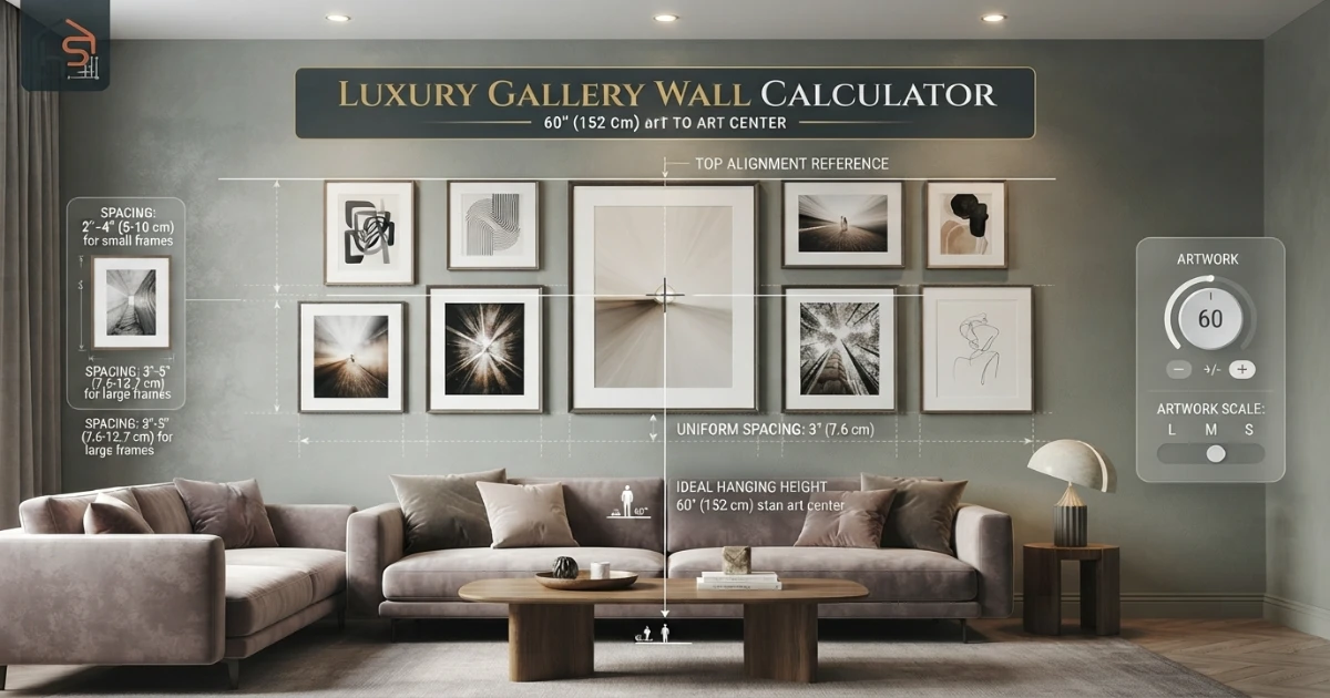
Measure the wall
Start with the available wall width before choosing frame count. Note furniture, outlets and trim in the space.
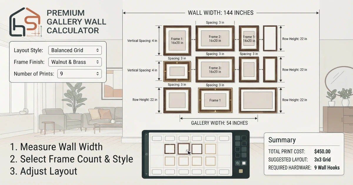
Plan the arrangement on paper first
Tracing frames onto kraft paper and taping the templates to the wall catches spacing issues before any holes are made.
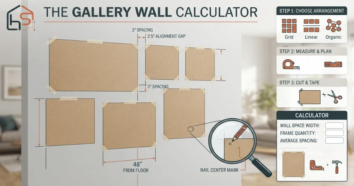
Confirm the hanging height
Centering the layout at eye level, or just above furniture, keeps the wall feeling intentional rather than accidental.
How to plan a gallery wall — the complete guide.
The most common gallery wall mistake is hanging frames too high and too spread out. Most people, working alone and without a plan, instinctively hang each frame higher and further apart than they intend to, which leaves the finished wall feeling scattered and disconnected from the furniture below it.
Planning the full layout on paper first, then hanging every frame from that plan, is what separates a gallery wall that reads as intentional from one that reads as an afterthought.
A gallery wall is one of the highest-impact, lowest-cost ways to fill a blank wall, but it’s also one of the easiest projects to get subtly wrong. Unlike hanging a single large piece of art, a gallery wall involves several interacting decisions at once: how many frames to use, how big they should be relative to the wall, how far apart to space them, how to arrange them, and at what height the whole composition should sit.
Getting any one of these wrong doesn’t ruin the wall outright, but it does make the difference between a gallery wall that looks curated and one that looks like it happened by accident. This guide walks through each decision individually, in the order a professional installer would typically work through them.
Step 1: Measure the wall and identify its real constraints
Start by measuring the full width of the wall or the section of wall available for the gallery arrangement, and note anything that constrains the layout: light switches, outlets, doorframes, windows, and any furniture that will sit below or beside the finished wall. A wall that looks like a single open rectangle at a glance often has hidden constraints, such as a thermostat mounted at exactly the height you’d otherwise want to hang a frame, and catching these early prevents having to redesign the layout mid-installation.
Step 2: Decide how many frames the wall can comfortably hold
As a general starting point, most gallery walls use somewhere between five and twelve frames, with smaller accent walls working well with as few as three to five pieces and larger statement walls sometimes using fifteen or more. The right number depends less on a fixed rule and more on how large the individual frames are relative to the wall: a wall filled with five large frames can look just as complete as one filled with twelve small ones, so frame count and frame size should always be decided together rather than frame count being chosen first in isolation.
Step 3: Choose a layout style that matches your frame collection
If your frames are all the same size, or close to it, a grid layout is usually the most straightforward choice, since it relies on consistent spacing rather than careful visual balancing. If you’re working with a mismatched collection of frame sizes and shapes, whether inherited, thrifted, or collected over time, a salon-style layout embraces that variety rather than fighting it.
A single row suits narrow hallways and walls where a multi-row grid wouldn’t have the vertical room to breathe, and a symmetrical layout, often built from matching pairs, suits more formal rooms or spaces flanking an architectural feature like a fireplace or a doorway.
Step 4: Calculate the total layout width before hanging anything
Once frame count, average frame size, and spacing are decided, the total layout width for a single row or grid column can be calculated directly: multiply the frame width by the number of frames in that row, then add the spacing multiplied by one fewer than the frame count, since spacing only occurs between frames, not on the outer edges. This total layout width needs to fit comfortably within the wall’s available width, ideally with a bit of breathing room left on each side rather than running edge to edge.
Step 5: Set spacing that stays consistent throughout the layout
Most gallery walls use two to three inches of spacing between frames for a tight, cohesive look where the frames read as one connected composition, while spacing closer to four inches or slightly more creates a more relaxed, airy feel where each frame reads more individually. The specific number matters less than consistency: a layout that alternates between two inches in one spot and five inches in another will always look unplanned, even if every individual frame is placed with care.
Step 6: Understand the standard hanging height rule
For a standalone gallery wall with no furniture below it, the widely used design guideline is to center the entire layout, not just a single frame, at 57 to 60 inches from the floor, which approximates average adult eye level. This means measuring the vertical midpoint of your full multi-row arrangement and aligning that midpoint, not the top or bottom edge, to the 57 to 60 inch mark. A common mistake is centering only the topmost or most prominent frame at eye level, which pushes the visual weight of the whole composition too high.
Step 7: Adjust the height rule when furniture sits below the wall
When a sofa, console table, dresser, or other furniture piece sits directly beneath the gallery wall, the eye-level rule gets overridden by a furniture-relative rule instead: the bottom edge of the lowest frame in the layout should sit 6 to 8 inches above the top edge of the furniture. This keeps the gallery wall visually connected to the furniture below it rather than floating disconnected higher up the wall, which is one of the most common reasons an otherwise well-planned gallery wall still looks slightly off once the room is fully furnished.
Step 8: Center the layout on the right reference point
A gallery wall above a specific furniture piece, such as a sofa or console table, should generally be centered horizontally on that furniture rather than on the wall itself, especially when the furniture isn’t centered on the wall to begin with. A standalone gallery wall with no furniture reference should be centered on the wall itself, or on the room’s main sightline if the wall is viewed primarily from one specific vantage point, such as facing a hallway entrance.
Step 9: Build a paper template before touching the wall
The single most effective way to avoid an unplanned pattern of nail holes is to trace each frame’s outline onto kraft paper or newspaper, cut out the shapes, and tape the paper templates directly to the wall in the planned arrangement. This lets you step back, adjust spacing, and confirm the overall composition looks right at full scale before a single frame goes up, and it’s far easier to reposition a piece of tape than to patch and repaint a misplaced nail hole.
Step 10: Mark hanging points directly through the paper template
Once the paper template arrangement is confirmed, mark the exact nail or hook position for each frame directly on the paper, accounting for where the frame’s actual wire or hanger sits relative to its top edge, then hammer the nail directly through the marked point on the paper before removing it. This method transfers your planned layout to the wall with far more precision than measuring and marking each point freehand after the paper templates are removed.
Step 11: Establish a baseline for grid and row layouts
Grid and single-row layouts rely on a shared baseline, meaning the bottom edges, top edges, or center points of each frame in a row align to the same horizontal line. Using a laser level, or a length of painter’s tape stretched taut between two points, to mark this baseline before hanging keeps a multi-frame row from drifting subtly out of alignment, which becomes very noticeable once several frames are up and viewed together.
Step 12: Balance visual weight in a salon-style layout
In a salon-style layout, visual weight, not just physical frame size, needs to be distributed across the composition. A large frame with a bold, dark mat or a heavy black frame carries more visual weight than a same-sized frame with a light mat and thin frame.
So balance dark and light, large and small, and busy and simple pieces across the wall rather than clustering all the visually heavy pieces in one corner and all the light ones in another.
Step 13: Keep sightlines and traffic paths in mind
Consider the height and angle from which the gallery wall will most often be viewed. A wall along a stairway is typically viewed at an angle while walking up or down, so frames are often hung following the diagonal rake of the stairs rather than in strict horizontal rows. A wall in a room where people are frequently seated, such as facing a sofa, benefits from a slightly lower overall placement than a wall in a hallway where it’s viewed exclusively while standing and walking past.
Step 14: Leave breathing room at the edges of the layout
The total layout width should leave at least three to six inches of clear wall space on each side between the outermost frame and the edge of the wall, the nearest doorframe, or the nearest piece of furniture. A layout that runs edge-to-edge on a wall, with no breathing room on either side, reads as cramped even if the internal spacing between frames is perfectly consistent.
Step 15: Plan for mixed frame sizes without losing consistency
When a layout intentionally mixes frame sizes, whether in a salon-style arrangement or a grid with one or two accent pieces, keeping a consistent frame color, mat color, or matting width across all the pieces helps the mixed sizes still read as one cohesive collection rather than a random assortment. This single unifying element does more to make a mixed-size gallery wall feel intentional than getting every individual spacing measurement perfect.
Step 16: Step back and reassess before finalizing
After the paper template is taped up, or after the first few frames are actually hung, step back at least six to eight feet and view the wall from the distance it will typically be seen from, not just up close. Details that seem important while standing directly in front of the wall, such as a half-inch spacing inconsistency, are rarely noticeable from a normal viewing distance, while larger issues like an off-center layout or an unbalanced arrangement of visual weight become much more obvious once you step back.
Hanging rules that prevent an uneven or disconnected gallery wall.
A calculator gives the best starting numbers, but the final layout still depends on wall obstacles, furniture placement, and how the arrangement looks in person. The rules below cover the details worth checking even after settling on a layout width and frame count.
Keep spacing between frames consistent at 2 to 4 inches, center the full layout at 57 to 60 inches from the floor for a standalone wall, or 6 to 8 inches above furniture when something sits below it, and always plan the arrangement on paper before hanging a single frame.
Plan on paper before the wall
Tape paper templates to the wall in the planned arrangement so spacing and balance issues get caught before any holes are made.
Center the layout, not one frame
Measure the vertical midpoint of the entire multi-row arrangement, not just the most prominent piece, when applying the eye-level rule.
Connect the wall to furniture below it
When furniture sits under the layout, keep the bottom frame 6 to 8 inches above it rather than defaulting to a fixed eye-level height.
Keep spacing consistent throughout
A single spacing measurement used everywhere reads as far more intentional than perfectly placed individual frames with inconsistent gaps.
Helpful wall and room planning topics.
A gallery wall rarely comes together from frame arrangement alone. Once you know the layout width and hanging height, it helps to plan the surrounding elements at the same time — the furniture it sits above, the room’s overall layout, and any nearby lighting. Use these supporting pages from the HomeStyle Calculator homepage to plan the rest of the room.
Six things professional installers always check before hanging.
Start from the center frame outward
Hang the largest or most central frame first, then work outward in both directions so spacing stays balanced on each side.
Use a laser level for multi-row layouts
A laser level keeps rows aligned across the full width of the wall far more reliably than measuring each frame individually with a tape measure.
Account for wire sag in the hanging point
A frame hung by wire sits an inch or two below its actual hardware point once the wire pulls taut, so mark nail positions accordingly.
Check stud locations before finalizing spacing
Heavier frames are safer hung into a stud. Knowing stud locations before finalizing the paper template avoids compromising the layout later.
Photograph the paper template before removing it
A photo of the taped-up template serves as a reference if a frame ever needs to be rehung in exactly the same spot after removal.
Leave room to add one more frame later
Planning slightly under the wall’s full capacity leaves room to add a new piece to the collection later without redesigning the whole layout.
Gallery wall questions — answered.
More calculators for every room decision.
Every tool uses professional designer formulas. Free, instant, no sign-up — just enter your wall or room and get the exact answer.
Bookmark HomeStyle Calculator for every wall in the house.
From a single statement piece to a full gallery wall, our free tools give you the exact layout and hanging height before you pick up a hammer.